
On this page I will be looking at the principles of interactive design. There are a number of specific areas that will be briefly addressed. The areas will include:
- Graphic design
- Composition
- Typography
- Aesthetic appeal
- Interactive Design
- Language and Terminology
- Semiotics
- Form
We will also be looking at the functional design of a website and the media such as:
- Navigational Design
- Visual Cues
- Usability
- Media Technology
- Interactive products
- Application tools
Graphic design
AIGA describe graphic design as an overall subject:
Graphic design is a creative process that combines art and technology to communicate ideas. The designer works with a variety of communication tools in order to convey a message from a client to a particular audience. The main tools are image and typography.
Graphic designers work with drawn, painted, photographed, or computer-generated images (pictures), but they also design the letterforms that make up various typefaces found in movie credits and TV ads; in books, magazines, and menus; and even on computer screens. Designers create, choose, and organize these elements-typography, images, and the so-called “white space” around them-to communicates a message. Graphic design is a part of your daily life. From humble things like gum wrappers to huge things like billboards to the T-shirt you’re wearing, graphic design informs, persuades, organizes, stimulates, locates, identifies, attracts attention and provides pleasure.
(Text from http://www.aiga.org/guide-whatisgraphicdesign/)
Colour theory
Colormatters and Tigercolor explain colour theory in detail:

Colour theory encompasses a multitude of definitions, concepts and design applications – enough to fill several encyclopaedias. Colour theories create a logical structure for colour. For example, if we have an assortment of fruits and vegetables, we can organize them by colour and place them on a circle that shows the colours in relation to each other.

With colours you can set a mood, attract attention, or make a statement. You can use colour to energize, or to cool down. By selecting the right colour scheme, you can create an ambiance of elegance, warmth or tranquillity, or you can convey an image of playful youthfulness. Colour can be your most powerful design element if you learn to use it effectively.
(Text from http://www.colormatters.com/color-and-design/basic-color-theory and http://www.tigercolor.com/color-lab/color-theory/color-theory-intro.htm)
Composition
Photographymad explain composition in pictures broadly and explain many key points to think about:
There are a number of established composition guidelines that can be applied in almost any situation, to enhance the impact of a scene.
- Rule of Thirds – Imagine that your image is divided into 9 equal segments by 2 vertical and 2 horizontal lines. The rule of thirds says that you should position the most important elements in your scene along these lines, or at the points where they intersect. Doing so will add balance and interest.

- Balancing Elements – Placing your main subject off-centre, as with the rule of thirds, creates a more interesting photo, but it can leave a void in the scene, which can make it feel empty. You should balance the “weight” of your subject by including another object of lesser importance to fill the space.
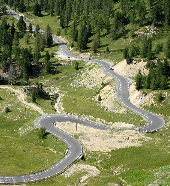
- Leading Lines – When we look at a photo our eye is naturally drawn along lines. By thinking about how you place lines in your composition, you can affect the way we view the image, pulling us into the picture, towards the subject, or on a journey “through” the scene. There are many different types of line – straight, diagonal, curvy, zigzag, radial etc – and each can be used to enhance our photo’s composition.
- Symmetry and Patterns – We are surrounded by symmetry and patterns, both natural and man-made. They can make for very eye-catching compositions, particularly in situations where they are not expected. Another great way to use them is to break the symmetry or pattern in some way, introducing tension and a focal point to the scene.
(Text From http://www.photographymad.com/pages/view/10-top-photography-composition-rules)
Typography

Typography is a large subject itself and I found naldzgraphics.net explain clearly what is needed to know:
As a designer, you would always use type in your works. Hence, it is important for you to know the basics of typography. Typography is a central component of design and one of the primary ways of communication. This has been passed from generations and has undergone various improvements. To date, there are thousands of typefaces and fonts that can be found in the Internet. Its usage has evolved and is one of the important things in design, business and marketing. Typography is the arrangement of type for different uses. It could relay different messages aside the words itself. The mere choice of typefaces and its arrangement can greatly affect an entire design.
- Type families – This is important for you wouldn’t be able to recognize fonts and their types if you are not aware of this. Since you are a designer and you use type in your designs, you need to have apt knowledge on this. Every font style has different type families. It could be Condensed Bold, Condensed Black, Ultra Light, Ultra Light Italic, Light, Light Italic, Regular, Roman, Italic, Extended or Combined Styles.
- Type face – Usually mistaken with font. But they are different. Fonts refers to a specific member of a type family if it is roman, boldface, etc while a typeface refers to the consistent visual appearance or style of a font. You need to select typefaces that suit the theme of your design. Typeface is divided into two main categories, the Serif Font and the Sans Serif Font. Serif Fonts – Serifs are small lines at the ends of character strokes. Serif fonts are font styles with serifs at every character. These are usually used in books for it guides the eyes from letter to letter. Sans Serif Fonts – Meanwhile, a San Serif doesn’t use a serif. It is usually used in magazine headlines and in websites for it is easier to read in the computer screen.
- Size – The use of different sizes will affect the design and the message of the design. But you’ll find it really important to use different sizes to give emphasis to some parts of the design. For instance, in a newspaper, headlines are always bigger that the text for the news story. On the other hand, banner headlines that are used for the most important news story, are bigger than the other headlines in the paper. Same as in designing, you will find it helpful to use various font sizes.
(Text from http://naldzgraphics.net/tips/what-designers-need-to-know-about-typography/)
Aesthetic appeal
Aesthetics is the human perception of beauty, including sight, sound, smell, touch, taste, and movement – not just visual appeal. Aesthetics is the aspect of design and technology, which most closely relates to art and design, and issues of colour, shape, texture, contrast, form, balance, cultural references and emotional response are common to both areas.
Like the artist, the design and technologist makes use of creativity and imagination, divergent thinking, personal interests, inspiration from design movements and from nature. And like the artist, the design and technologist will usually make use of sketches in the early stages of developing a design.
(Text from http://www.digitaldandt.org/index.php/electronics/design-develop-manufacture/product-design?start=1)
Interactive Design
Language and terminology
In any industry there will always be words and terms, which you will not understand. These words or terms are commonly known as in house jargon. In order to give some sort of understanding, here are a few words and definitions from Web Design glossary:
AJAX – AJAX stands for Asynchronous JavaScript and XML. AJAX is a way of developing Web applications that combines:
- XHTML and CSS standards based presentation
- Interaction with the page through the DOM
- Data interchange with XML and XSLT
- Asynchronous data retrieval with XMLHttpRequest
- JavaScript to tie it all together
Breadcrumb – In Web design a breadcrumb or breadcrumb trail is the part of the navigation that shows you where you are, similar to the fairy tale “Hansel and Gretel”. Breadcrumb trails are often found near the top of Web pages and define both the current location within the site hierarchy as well as primary pages above the current page.
Font Weight – The weight of a font refers to how light or bold it is. The heavier a font is the bolder it will look on the page.
Kerning – The adjustment of spacing between pairs of letters in words. Usually defined by the font family. Kerning creates letterforms similar to ligatures when the letters are pushed together until they are touching. Kerning is a form of micro whitespace that allows you to control the legibility of text on Web pages.
These are just a few words for web design language and terminology, you can find plenty more at Web Design Glossary
(Text from http://webdesign.about.com/od/webdesignhtmlatoz/a/blglossary.htm)
Semiotics
Semiotics has three sections and snap2objects.com explains them very well.
The three kinds are:
- Icons – a clear representation of the object itself, keeping its characteristics. There’s no distinction between the icon and the real object. Examples are: photos, drawings, imitations, onomatopoeias and others.
- Index – They indicate something. The index connected with its meaning (not arbitrary) but unlike the icon, it’s not the object itself. As examples, we can say that smoke indicates fire, smiles indicate happiness, and fresh coffee smell in the morning indicates that someone preparing breakfast. Even medical symptoms and measuring instruments are indexes, because they indicate something.
- Symbols – They have no resemblance to the real object, it’s a result of a convention. A symbol can only make meaning if the person already knows that, so, this is a matter of culture and previous knowledge. We all know that a dove represents peace, but there’s no connection between the animal and peace, it’s just a convention. Letters and words are examples of symbols. The graph sign (words) has no direct link to the thing itself, but for each culture, they make meaning. For us, the colour black represents the mourning, but this colour changes for different countries and cultures.
(Text from http://www.snap2objects.com/2009/07/semiotics-a-powerful-communication-tool-for-designers/)
Form
Web forms don’t have to be boring and, using CSS or Flash, you can easily make sure that they are appealing and effective. To get noticed, you need to come up with something unique and interesting — symbols, icons, colours, position or the size of web form are often used to achieve interesting design solutions. We’ve searched for some examples and we’ve found them. Creative, original and unusual web forms.
Since web form is probably one of the most important sections on the web site, it’s necessary for you as a designer to make sure that visitors can easily understand what information they need to fill into the form fields. Complex and long web forms increase the cognitive load for users — they are just harder to deal with. In this context, preferring simple and clean solutions seems like a sound approach. However, if the form was designed with an attention to details and looks good, it’s also reasonable to use some attractive imagery in the forms.

Example of a web form from Swfir
(Text from http://www.smashingmagazine.com/2008/04/17/web-form-design-modern-solutions-and-creative-ideas/)
Navigational Design
The navigation menu is perhaps a website’s single most important component. Navigation gives you a window onto the website designer’s creative ability to produce a functional yet visually impressive element that’s fundamental to most websites. Because of their value to websites, navigation menus are customarily placed in the most visible location of the page, and thus can make a significant impact on the visitor’s first impression.
Use of navigation
3-D Navigation – Lately, we’ve seen a trend towards design elements that sit on a higher z-plane; that is, they appear closer than other elements on the page. This trend is commonly applied, no surprise, to navigation menus.
Speech Balloons – Designing menu items in the shape of speech balloons, or speech bubbles, appears to be another popular trend. It’s a great way to break out of the conventional rectangular menu.
Icons In Navigation – Elaborate and highly visual designs are now widespread because bandwidth is no longer much of a concern. Over a year ago, we noted that visually appealing icons are increasingly being used, and this trend has continued. Icons not only are eye candy but help create visual recognition for users. Having said that, one should keep in mind that it’s always important to keep the loading time as short as possible, thus making the page as responsive as possible. In general, it’s more important than additional visual clues; however, used properly and moderately, the latter can assist users in their scanning process and make the content of the page easier to perceive and navigate.
Unusual Shapes – Because most websites have straight edges and sharp corners, irregular shapes give you a chance to break from the norm. One current trend is to give menus an amorphous shape to make them really stick out.
Example Nav Bar from New Look Media

Visual Cues
JavaScript Animation – With JavaScript frameworks making it easier for Web designers to create animated page elements using just a few lines of code, designers have been using JavaScript lately for more aesthetic than functional purposes.
Rounded Corners – Rounded corners are often used to soften sharp rectangles. The trend has carried over from call to action buttons to menu items, whose appearance as buttons is meant to entice users to click on them.
(Text From http://www.smashingmagazine.com/2010/01/04/showcase-of-modern-navigation-design-trends/)
Media Technologies
Interactive products
Multimedia is one of the most innovative and fastest-growing areas of application of information technology and design. Multimedia technologies we use combine modern computer hardware for sound, vision and virtual reality with appropriate software authoring tools to produce integrated products that are widely used in education, entertainment, commerce and industry. A cool flash intro for your web site is a way to introduce your web site to your visitors, and to tell them about what your site is all about. The flash intro should create the enthusiasm to view your web site further. Intros need to be fast, small, and interesting.
You can present videos complete with audio or site-enhancing sound effects; or, go with a full-blown interactive animation with Shockwave Flash and Macromedia Flash. Multimedia products include:
- Interactive applications
- Audio (narration, dialogue, or sound effects)
- Music
- Film, video, and photographs
- Flash animation and graphics
- Broadcast flash motion graphic
- Animation background flash
(Text From http://www.lucentwebs.com/multimedia.html)
Application tools
Fireworks – Adobe Fireworks is a commercial raster and vector graphics editor hybrid from Adobe that’s available for the Mac and Windows operating systems. Designed specifically for web designers (unlike Photoshop), Fireworks brings you a plethora of tools and options that make full web layout prototyping a breeze. Among its notable features are: “slices” for slicing and dicing a design mock-up into HTML/CSS for rapidly creating prototypes (though you should avoid using auto-generated source code for the end-build), the ability to package an entire site design as a PDF with clickable components for interactive and impressive site prototypes, and optimization tools for making your web graphics as lightweight as possible.

Dreamweaver – Adobe Dreamweaver is a commercial application for web development that’s available for the Mac and Windows operating systems. Its featured-packed suite of tools and options include: syntax highlighting and very smart Code Hinting, a built-in FTP client, project management and workflow options that make team work effortless, and Live View – which shows you a preview of your source code.

Panic Coda – Panic Coda is a shareware web development application for the Mac OS X operating system. It seeks to reduce the amount of applications (such as an FTP client, CSS editor, a version control system, etc.)

Photoshop – Adobe Photoshop is a very popular commercial graphics editor available for the Mac and Windows operating system. Created for professional photographers and designers, it is the ideal application for manipulating images and creating web graphics.

Firebug – Firebug is a free, open source in-browser web development tool for the Firefox web browser. It’s many features include: on-the-fly HTML and CSS editing for tweaking or debugging, a Console for logging, analyzing and debugging JavaScript, and an intuitive Document Object Model (DOM) inspection tool to help you quickly see how the elements of a web page relates to one another.

(Text from http://sixrevisions.com/web_design/top-five-web-design-tools/)
References http://www.aiga.org/guide-whatisgraphicdesign/ (Accessed April 2013) http://www.colormatters.com/color-and-design/basic-color-theory (Accessed April 2013) http://www.tigercolor.com/color-lab/color-theory/color-theory-intro.htm (Accessed April 2013) http://www.photographymad.com/pages/view/10-top-photography-composition-rules (Accessed April 2013) http://naldzgraphics.net/tips/what-designers-need-to-know-about-typography/ (Accessed April 2013) http://www.digitaldandt.org/index.php/electronics/design-develop-manufacture/product-design?start=1 (Accessed April 2013) http://www.snap2objects.com/2009/07/semiotics-a-powerful-communication-tool-for-designers/ (Accessed April 2013) http://webdesign.about.com/od/webdesignhtmlatoz/a/blglossary.htm (Accessed May 2013) http://www.smashingmagazine.com/2008/04/17/web-form-design-modern-solutions-and-creative-ideas/ (Accessed April 2013) Web development site